We just launched an updated version of the NAB Show site for their mega convention that leverages an interesting, highly successful new navigational pattern that we’re excited to share.
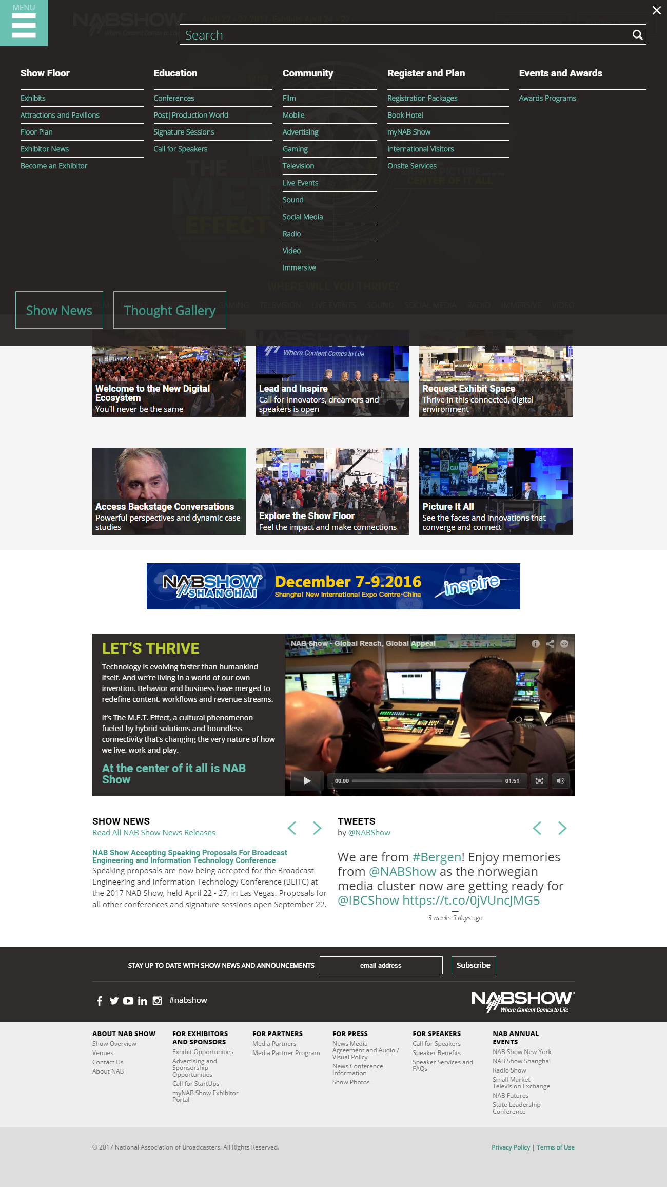
Rather than the usual array of main navigation tabs and flyout menus, the new site uses a single mobile-friendly menu button that triggers a full screen overlay.
At desktop sizes, all the options are available in a multi-column layout (essentially a mega menu). On mobile, it is presented as a single column of accordion options. This works really well when combined with the omnipresent fixed header at the top.
Desktop View:
Mobile View:
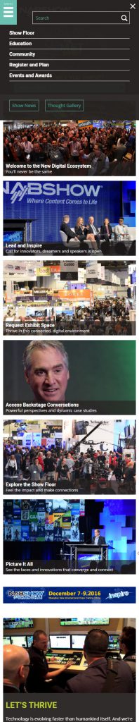
Note that the site search is contained within the same overlay. The additional secondary navigation tab bar that appears below the “hero imagery” provides an entry point for each of their key audience types. The tabs reduce down to a select menu on smaller screens.
The Secret Sauce
 To make this navigation pattern possible, we worked with NAB to strategically reduce the amount of content on the site so that we could present it all in a single layer of menu options.
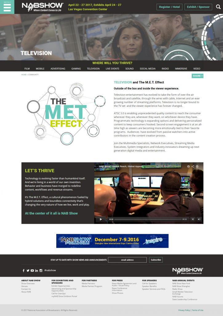
We also reorganized the new options to make it work better in this format, and reduced the amount of content included on the pages themselves, opting for a single column of content with prominent callouts and large photos with no sidebars.
We’re really excited to roll this new navigation out for other success stories. Are you next? You know how to reach us!

